RESPONSIVE EXPERIENCE
One continuous experience adapted for phone, tablet, and desktop.
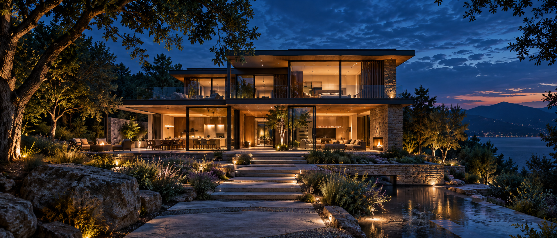
CASE STUDY 001 · LIVE WEBSITE
01 · THE CHALLENGE
Steward Living Design brings architecture, interiors, landscape, and project delivery together. A conventional portfolio would separate those parts and make the customer assemble the story alone.
We shaped the website around how the business sees a project: begin with the people and the place, understand the relationships, then guide the work from the first idea toward design and construction.
THE WEBSITE NEEDED TO SHOW
HOW EVERYTHING CONNECTS.
02 · FROM BUSINESS TO WEBSITE
Architecture, interiors, landscape, construction coordination, and the life of the homeowner belong to one connected service.
Visitors can move from inspiration to services, projects, process, and a clear project request without losing the story.
Large visual spaces, readable typography, responsive layouts, and simple actions make the site useful on a phone or computer.
Project intake, contact, sharing, language access, and future project records support the work after a visitor arrives.
03 · THE WEBSITE SYSTEM
Thoughtful, practical design shaped by your home, your land, and the way you live.
EXPLORE OPTIONS ↓04 · CAPABILITIES DELIVERED
One continuous experience adapted for phone, tablet, and desktop.
A language-ready structure keeps live text separate from imagery so content can be translated without breaking the design.
Customers may explain a need naturally instead of completing a long technical form.
Plans, sections, perspectives, progress, and completed work can stay connected to one project story.
Visitors can save the company contact or share the website from the device they already use.
Public presentation remains separate from owner records, website care, change requests, and recovery checkpoints.
05 · THE RESULT